3.10 Time Intelligence
Before
we look at some of the advanced functionality of the PerformancePoint
Report web part, let’s take a look at another important aspect of most
BI solutions: time intelligence.
Practically every dataset has some aspect of time involved, and more
often than not, data is analyzed over specific time periods. To show how
this works in PerformancePoint, we’ll add a filter to our report that
will allow us to select a specific time period and will automatically
update our reports accordingly.
Switch
back to Dashboard Designer. Time intelligence must first be configured
on the data connection before it can be used. Double-click the
AdventureWorksOLAP connection, and then switch to the Time pane.
Our
sample cube has various dimensions that we can use for time
intelligence. For the purposes of this demonstration, select
Date.Date.Calendar from the Time Dimension drop-down.
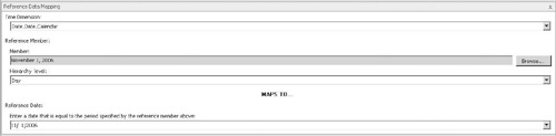
With
the dimension defined, we can set a reference member. All we’re doing
here is selecting a specific value from our chosen time dimension and
then specifying to what actual value it corresponds. Click the Browse
button, and then select a single day from the Date.Date.Calendar
hierarchy.
In
the Hierarchy Level drop-down, select Day and then enter the
corresponding date in the Reference Date text box, as shown next:
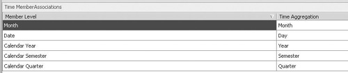
PerformancePoint
has its own time aggregation levels that need to be mapped to the
corresponding levels in our dimension hierarchy. In our case, this is
pretty much a one-to-one mapping.
In the Time Member Associations section, select the appropriate Time Aggregation values, as shown:
Save the changes to the AdventureWorksOLAP data connection.
We can now make use of our time intelligence functionality to create a filter for our sample dashboard.
Switch to MySampleDashboard, and then click Filter from the Dashboard Items section of the Create ribbon.
In the Select a Filter Template dialog, select Time Intelligence, as shown:
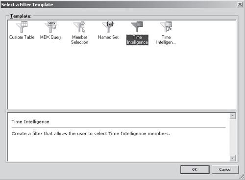
Click Add Data Source, and then select AdventureWorksOLAP.
Add
formulae as shown in the following illustration. This step warrants a
bit of further explanation. Time, of course, is always changing. By
tomorrow, today will have become yesterday. To accommodate this constant
change, values shown in the time selector are calculated using simple
formulas that take the current date into account. You’ll see this in
action by creating a selector that shows how to select from one of the
previous four quarters.
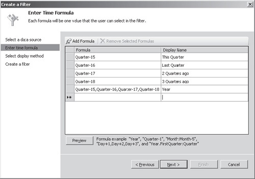
Note
We’re subtracting 15 from the current quarter because
the AdventureWorks data set contains data from 2001 through to 2006, so
subtracting 15 quarters will ensure that we’ve got something to see in
our report. Depending on the version of the sample data that you’re
using, you may need to adjust the formulae accordingly.
Click Next, and then select List as the Display Method. Click Finish to create the new filter. Type the name MyTimeFilter.
Switch back to the MySampleDashboard item and drag the new filter from the Details pane onto the left column.
We
can hook the filter up to our reports by dragging the
AdventureWorksOLAP field onto the Drop field to create a connections
section of the appropriate report. In the Connection dialog, accept the
default values of Connect To: Date Calendar and Source Value:
AdventureWorksOLAP.
Do this for both reports, and then deploy the updated dashboard to SharePoint.
Our
dashboard now contains a drop-down selector that we can use to select
the date range for our reports. Notice that when we select Year, a chart
is drawn for each quarter in the year rather than a single chart
covering the entire period. This happens because we defined year as a
series of quarters rather than a single time period, and our chart is
bound to use a time period as one of its axis.
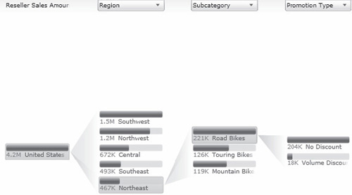
3.11 Decomposition Tree
New in 2010—Although
we specified which dimensions and measures were to be used on our
reports together with the layout and other options, all of this stuff
can be changed dynamically by the user so that he or she can further
analyze the data being represented. In reality, when we create a
dashboard, we’re simply defining the starting point for further analysis
by the user. When a user right-clicks any PerformancePoint Report web
part, a context menu appears and presents an array of options, such as
drill up/drill down and measure selection.
The Decomposition Tree is a Silverlight control that
allows users to drill down visually into data using any of the
dimensions and measures that are available within the cube. Clicking
each data item presents a list of dimensions that can be used to expand
the dataset as well as relevant properties and rollup information on the
current selection. The best way to understand the Decomposition Tree is
to mess around with it. To show the control, right-click any data
element—for example, right-click a pie chart slice or a number on the
grid report, and then select Decomposition Tree from the context menu.
The control will be shown as follows: